Why HayyuDoc Collected Patient Context Before the Consultation
Visit Live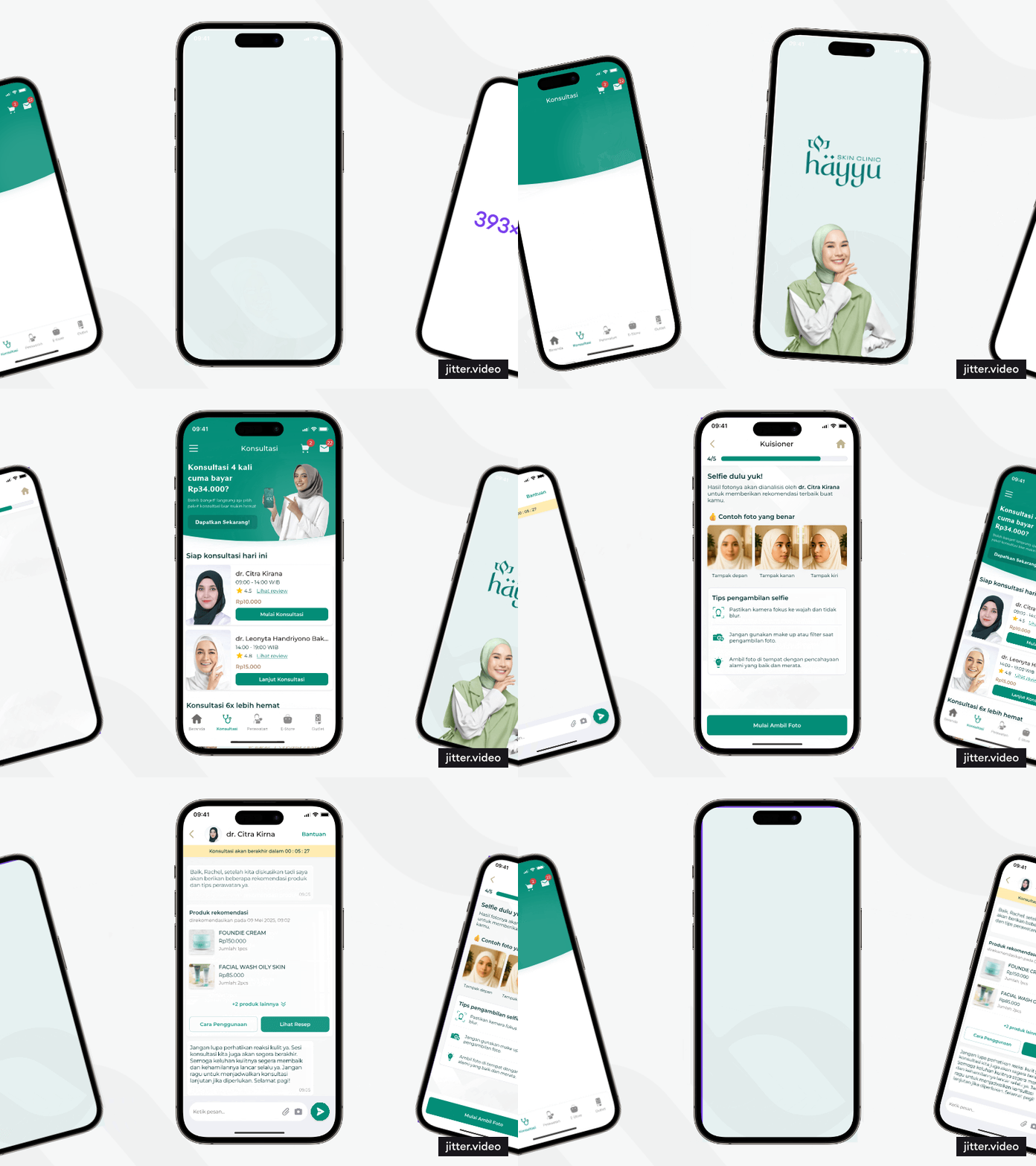
The Decision in Brief
HayyuDoc was preparing an online consultation feature. According to the product brief, each consultation had a limited session window, so I worked with the Product Manager as the sole Product Designer to collect basic patient context before the consultation began. The feature is now live in HayyuDoc, but consultation-specific adoption and completion metrics are not available for publication.
The central decision was to move basic information-gathering out of the live session. The weaker option was to ask for context after the consultation began, which would use part of a limited session for orientation. Moving intake earlier was intended to preserve that time, but it added work before patients could reach a doctor.
Limited Session Time Made Preparation the Real Problem
Hayyu is a women-focused skin-clinic network in Indonesia. HayyuDoc already supported reservations, digital treatment records, before-and-after photos, product shopping, and skin education. The product brief added online consultation and set a limited window for each session.
The brief called for the patient's concern, its duration, possible triggers, skincare routine, previous treatment, relevant medical history, and skin photos. Without preparation, those questions would need to be handled after the session started. That made the setup before consultation the main design problem.
What I Owned, and Who I Worked With
The Product Manager supplied the product requirements and worked with me on the product direction. I owned the consultation journey, assessment, skin-photo submission, payment-to-consultation sequence, UI, and developer handoff. My scope ended at handoff, so I do not attribute engineering implementation or medical approval to my design role.
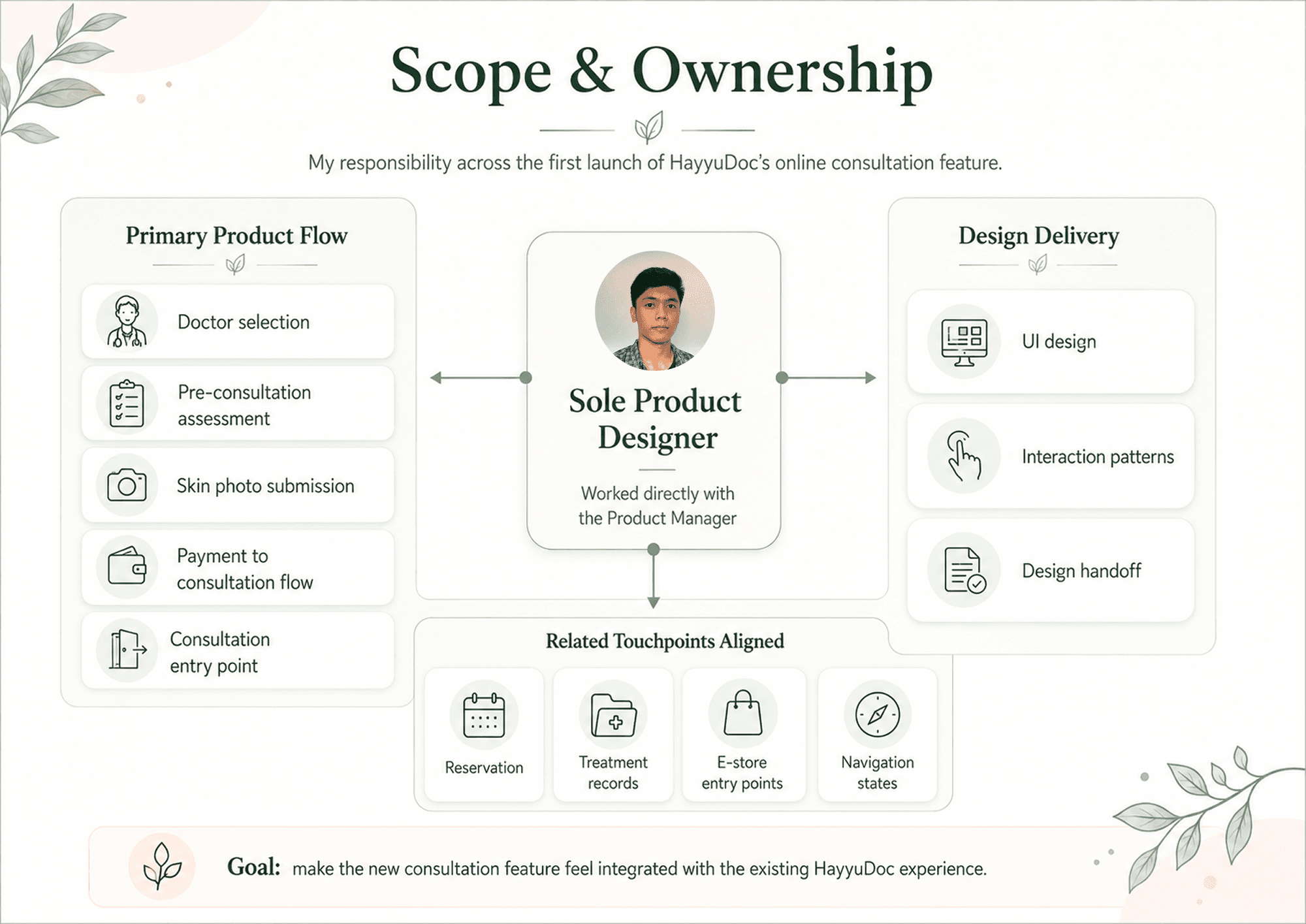
The scope map records the design responsibilities described here and the working relationship with the Product Manager.
I also aligned the components and navigation touched by consultation with existing HayyuDoc patterns. This was supporting work, not evidence of consultation adoption or product-wide impact.
Move Patient Context Before the Consultation
The designed sequence was simple: choose a doctor, provide written context, upload skin photos, pay, then start the consultation. Three choices made that sequence work.
Choose a Doctor Before Asking for Sensitive Details
Patients choose from the available doctors before entering their skin concerns. The sequence shows who will receive the information, but no increase in trust or satisfaction was measured.
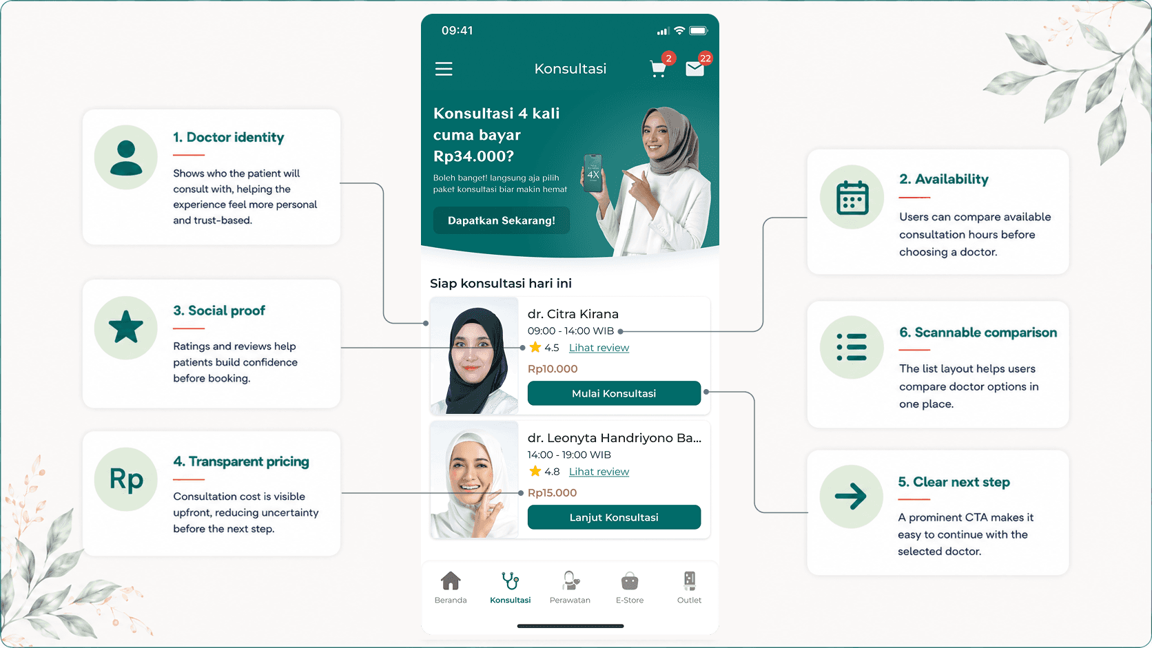
The screens document doctor selection as the first step in the designed consultation journey.
Collect Written Context and Skin Photos
Based on the brief, the assessment covers the main concern, duration, triggers, routine, previous treatment, and relevant medical history. The photo step asks for clear views of the affected area. These screens were designed to give doctors written and visual context, but this case study does not claim clinical validation or a measured improvement in consultation quality.
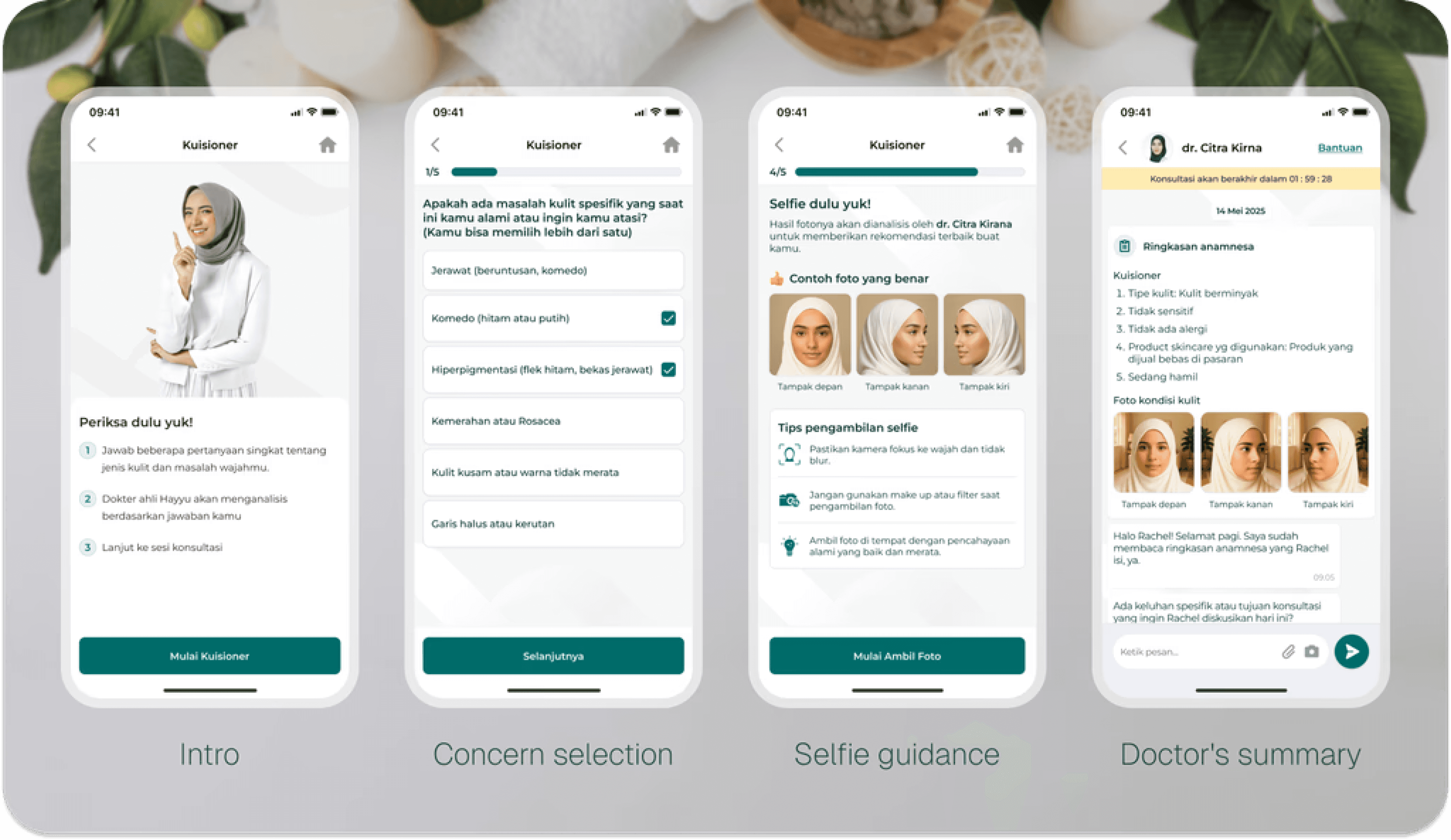
The assessment and photo screens show the context requested before a consultation can begin.
I used everyday Indonesian for the questions and photo instructions. The interface shows this writing choice, but published usability evidence is not available.
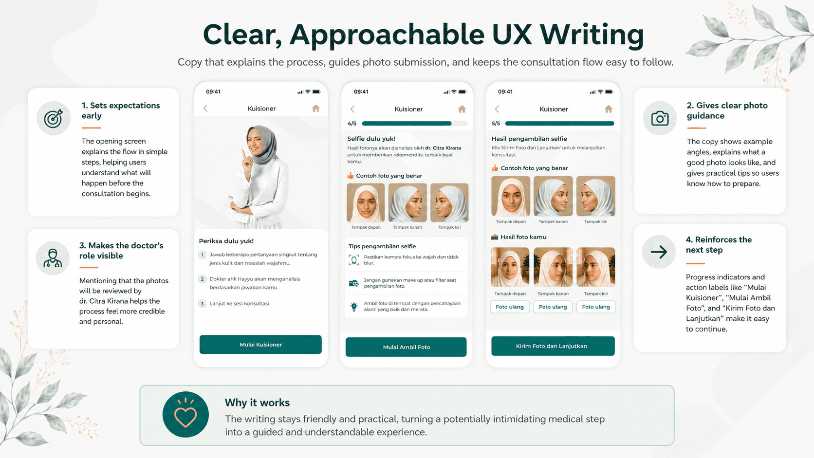
The copy examples document the intended reading level; they do not prove comprehension or usability.
Put Payment After Required Preparation
Payment follows the required assessment and photo steps. The alternative was to take payment before preparation, which risked a paid session starting without the requested context. The chosen order added upfront friction, so the flow explains why each item is requested and shows progress. This was an accepted design tradeoff, not a measured conversion result.
What Shipped, and What We Could Not Measure
HayyuDoc's public Google Play listing includes online doctor consultation through chat and video. The screens here document the delivered design scope: doctor selection, assessment, skin photos, payment, and consultation entry. I do not have adoption, completion, satisfaction, or session-quality metrics to publish, so this section reports status rather than impact.
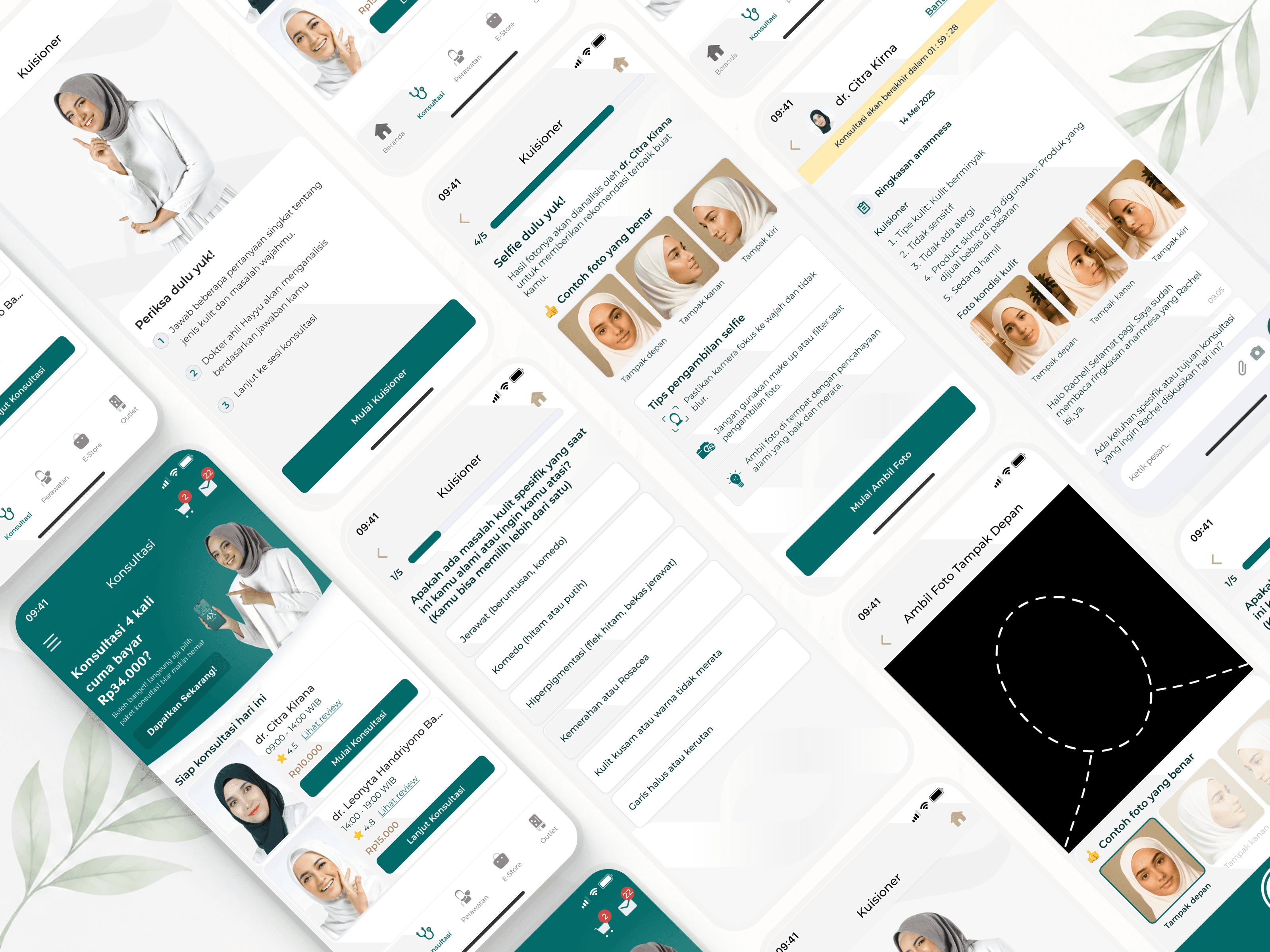
These screens show the designed journey. The public listing confirms consultation is available, not feature-level adoption.
Design the Moment Before the Main Interaction
The most useful lesson was not to design the main interaction in isolation. When two people meet with limited time and unequal context, the product can prepare the exchange before it starts. I now separate two questions: does the flow clearly set up the interaction, and do we have evidence that it improved the outcome? HayyuDoc answers the first through the delivered design. The second remains open until feature-level evidence is available.